

Product Design
UX Research
Design Systems
User Testing
Figma
Adobe Suite
Tokens Studio
iOS
Android
Web
16 weeks
Nectar v1 functioned primarily as a romantic personality test, designed to help individuals understand their relationship preferences.
The team wanted to expand the product into a full-fledged dating app where users could leverage those personality insights to discover, match, and build connections.
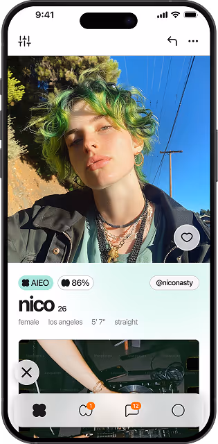
The redesigned Nectar introduced new features to help users understand their relationship readiness, and richer profile options that made it easier to connect meaningfully.
Admittedly, I came into this project knowing very little about dating apps 👴
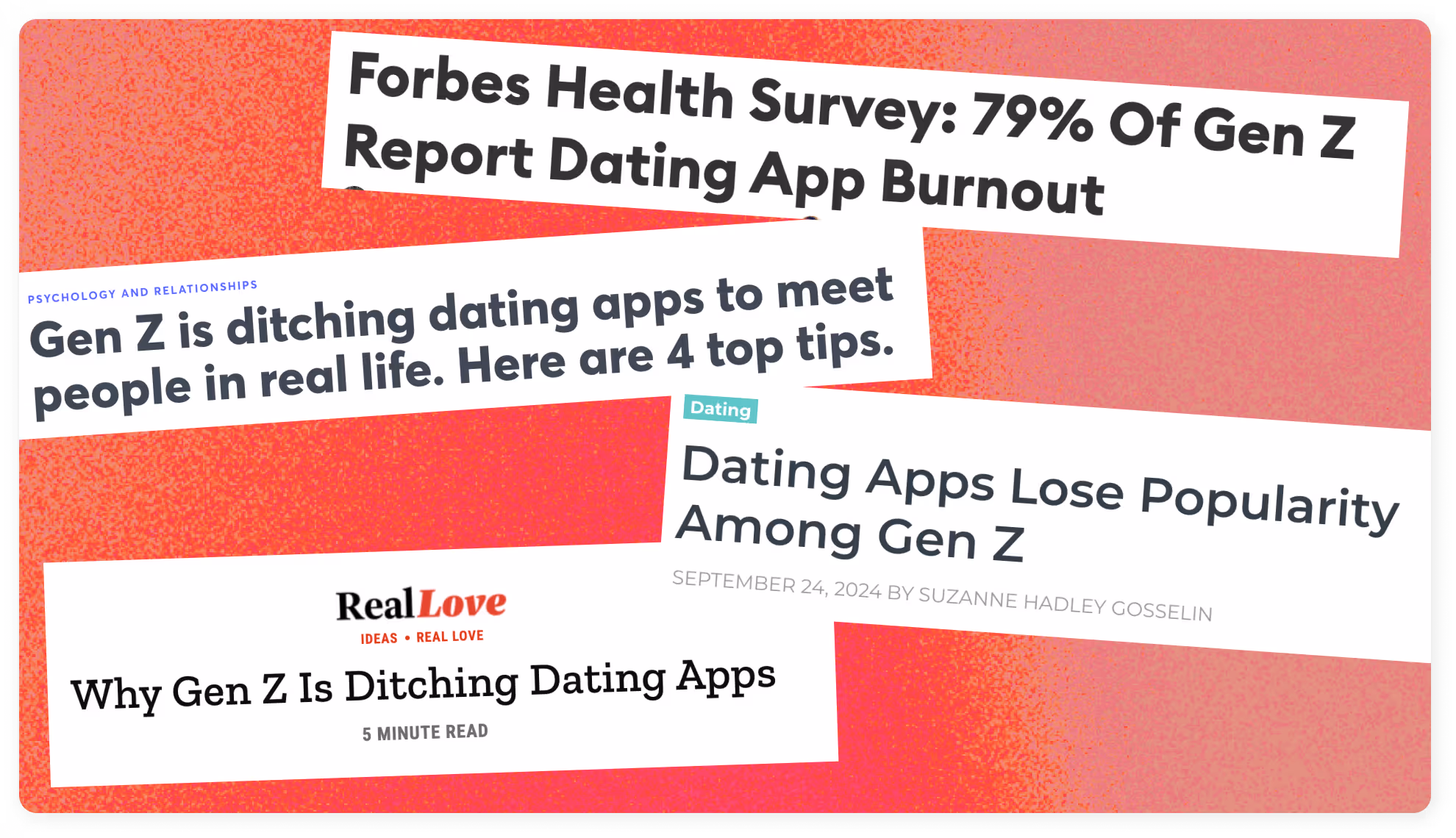
In order to catch up with the times and understand user needs, I spent a few weeks before kickoff conducting some research.
At the start of my involvement with the project, I spent some time with the Jubilee crew talking firsthand with college students about their feelings towards dating apps, and online dating in general.
These conversations were instrumental in understanding who I was designing for.
For this project, we were developing the brand aesthetic concurrently with the app flows. The brand identity needed to feel welcoming, casual, and trend forward.
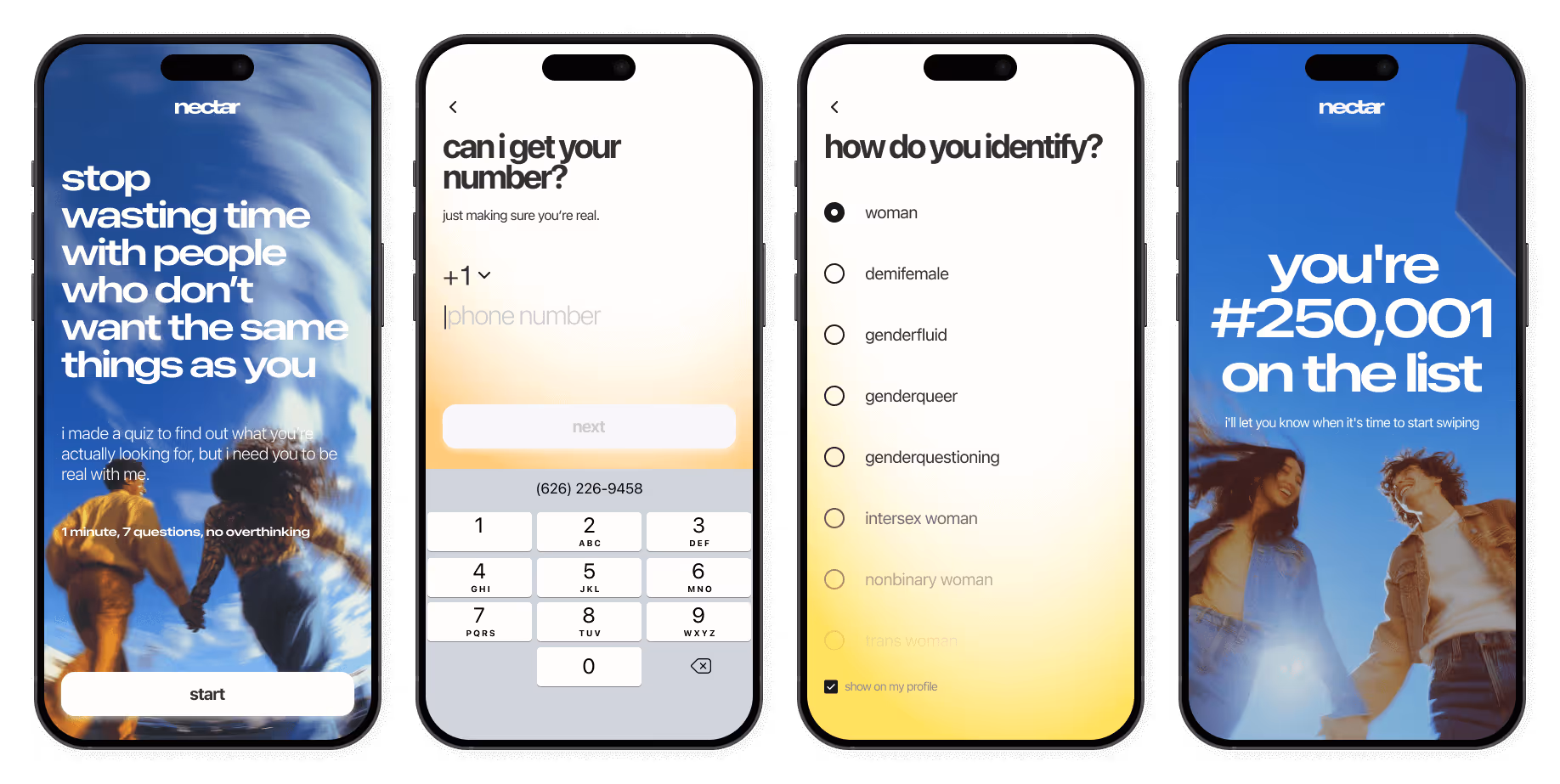
A few of the major challenges we faced when designing the onboarding flow were:
Early on in our conversations with potential users, we noticed a frustration with unequal expectations from the dating experience.
Some users wanted more causal interactions, some wanted something more serious, and some users were in-between.
As in all relationships, communication is key 🔑, and we wanted to equip users with the tools to communicate their preferences.
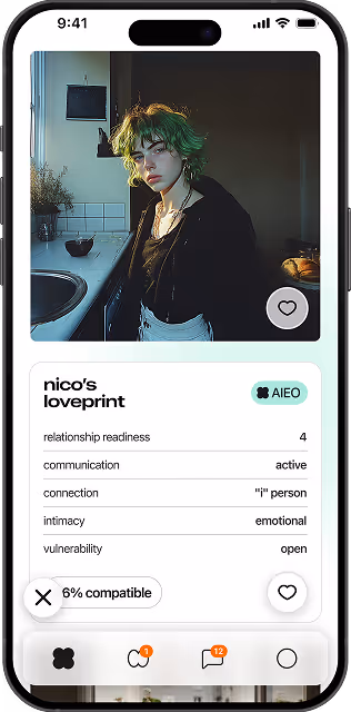
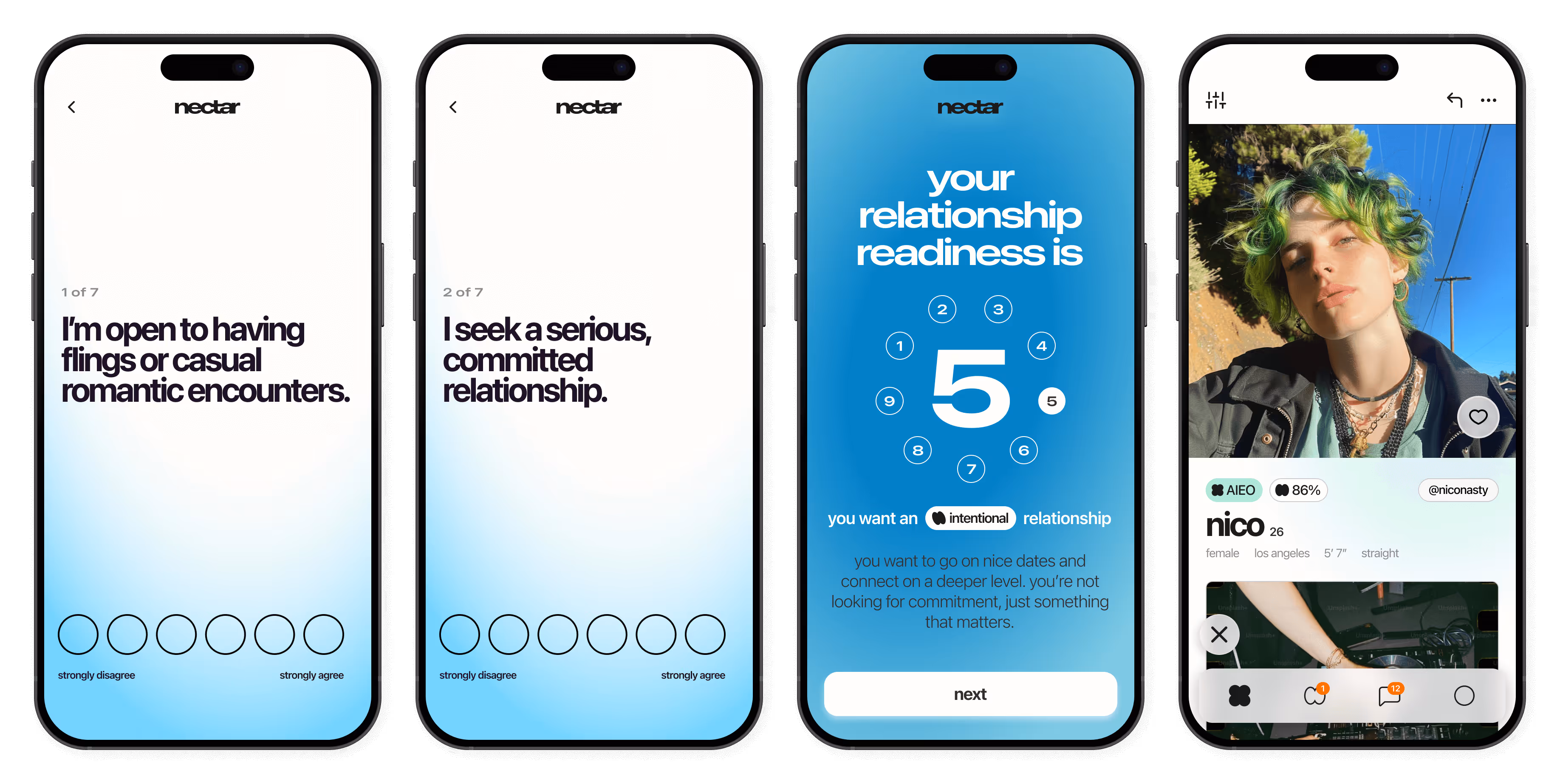
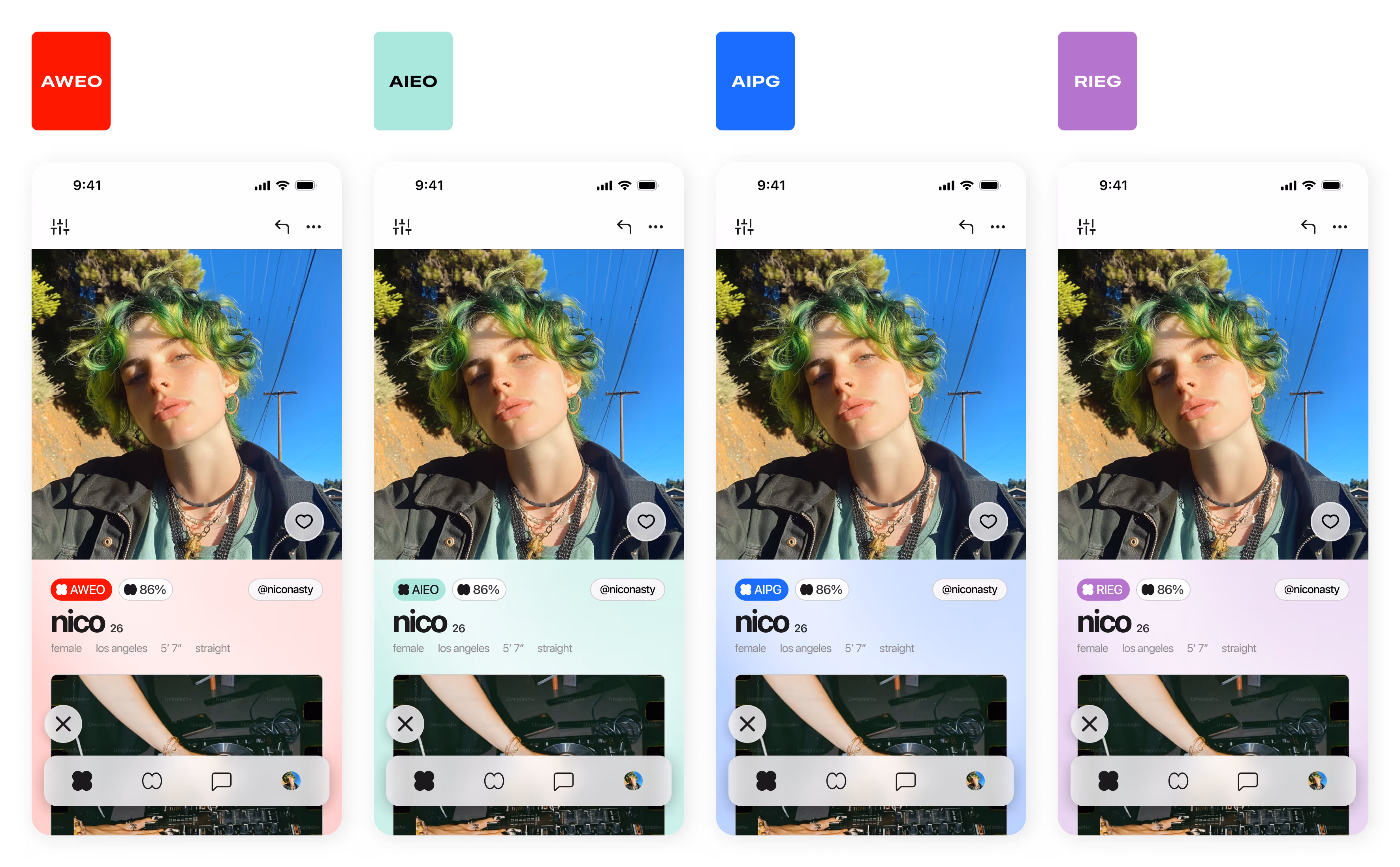
To support a more intentional approach to dating, we introduced the Loveprint and Relationship Readiness assessments, two assesments that users take during the onboarding flow to determine their dating preferences.
Based on their results, users were matched with a specific Loveprint type, which also determined the visual design of their profile.
In testing, users cited that Loveprint made identifying others with similar relationship goals a more intuitive and enjoyable experience.
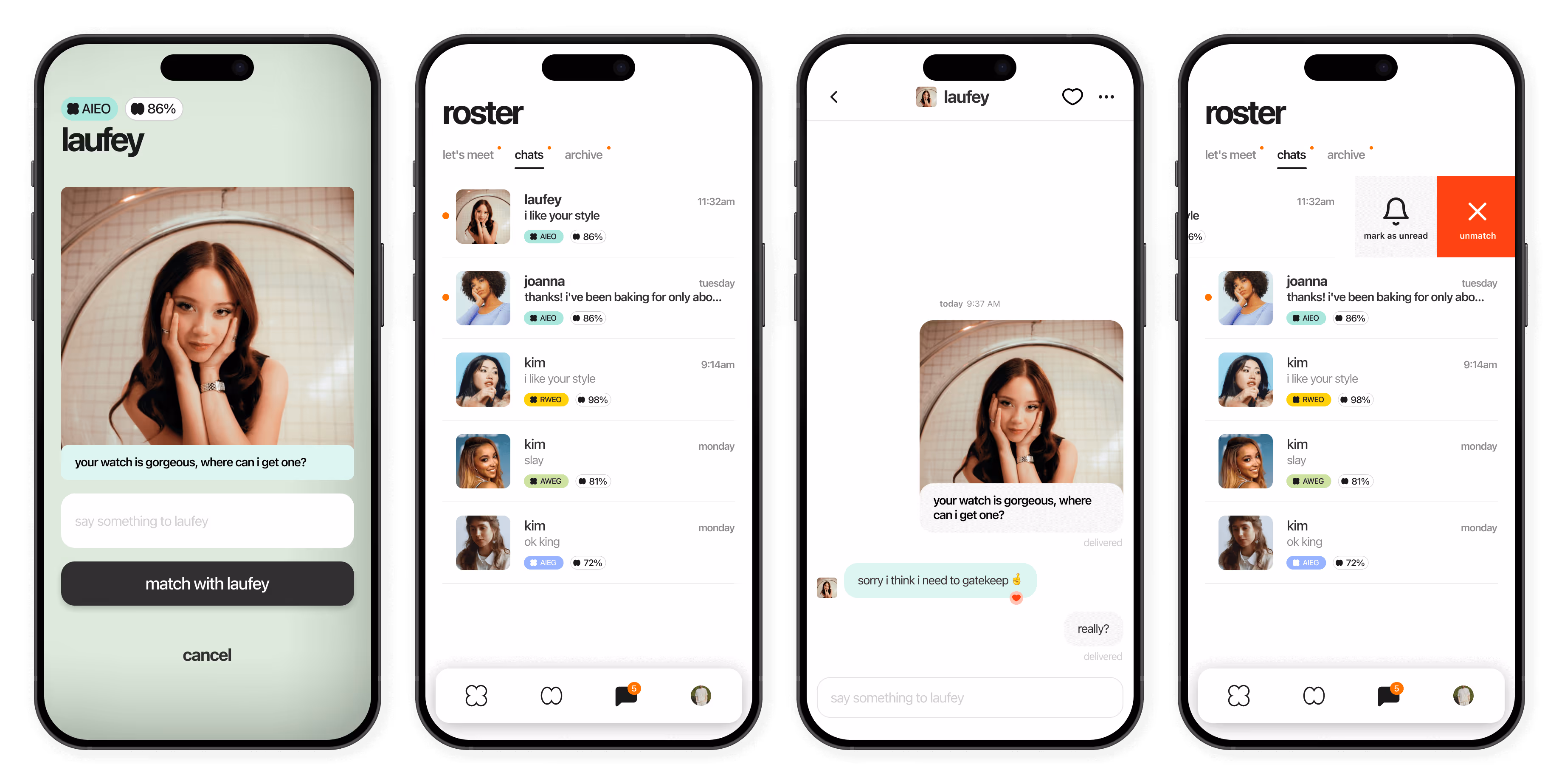
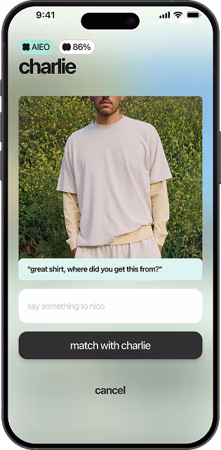
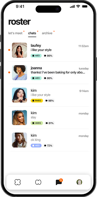
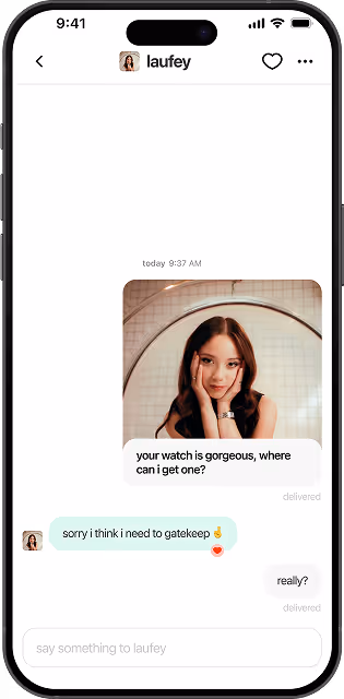
One of our biggest goals within this project was to make messaging feel easy, comfortable, and safe. We did this by integrating:
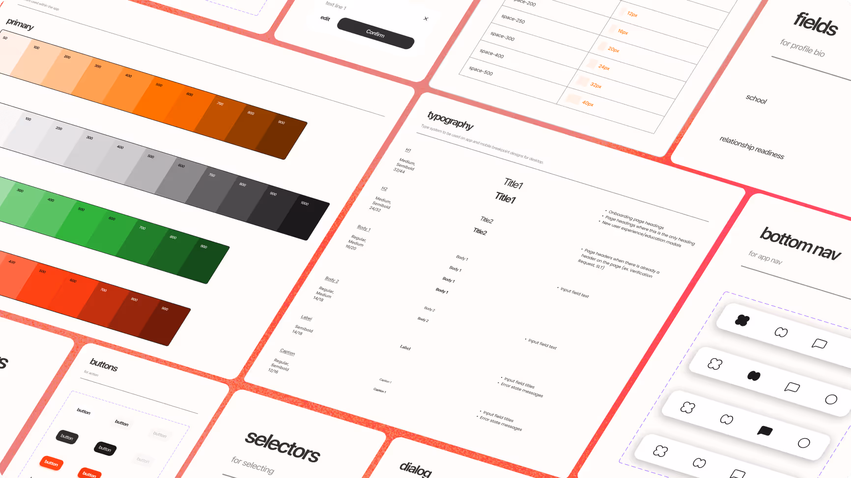
With so many moving parts, the design system for this project needed to be:
To do this, we implemented a design token workflow between Figma variables, Tokens Studio in order to quickly build atomic components that translated directly to code.
With testing and rapid iterations, the app saw:
The dating app landscape is rife with competition, a few of which are well established, larger teams, and infinitely more resources.
The team at Jubilee were undoubtedly experts in marketing and content creation, which gave the project a solid foundation to build upon, but most of the key stakeholders did not have experience bringing a technology product to market which made for a steep learning curve and required consistent communication to realistically set expectations.
Stakeholders often had shifting priorities, requiring adaptability in design iterations.
As the sole Product Designer, balancing multiple priorities across user experience, visual design, copywriting, product strategy, and project management was demanding.

The Nectar Dating App’s transformation was a significant step toward creating a platform that fosters intentional dating.
By focusing on user needs, implementing a structured design system, and refining key interactions, I helped shape an experience that prioritizes genuine connections over casual swiping.
Nectar now stands as a unique alternative in the dating app space, offering users a more thoughtful and engaging way to meet potential partners.


